css3扑克牌展开折叠动画特效
1、新建html文档。

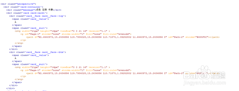
2、书写hmtl代码。
<div class="perspective">
<div class='card-container'>
<div class="message">点击 左侧 卡牌</div>
<div class='card card-card1'>
<div class='card__face card__face--top'>
<span class='card__value'>
A
</span>
<span class='card__suit'>
<svg width="21px" height="16px" viewBox="0 0 21 16" version="1.1" >
<g id="Page-1" stroke="none" stroke-width="1" fill="none" fill-rule="evenodd">
<path d="M1.6440972,15.2434886 L19.7934028,15.2434886 L10.71875,1.39282802 L1.6440972,15.2434886 Z" id="Path-2" stroke="#635F5C"></path>
</g>
</svg>
</span>
</div>
<div class='card__face card__face--btm'>
<span class='card__value'>
A
</span>
<span class='card__suit'>
<svg width="21px" height="16px" viewBox="0 0 21 16" version="1.1" >
<g id="Page-1" stroke="none" stroke-width="1" fill="none" fill-rule="evenodd">
<path d="M1.6440972,15.2434886 L19.7934028,15.2434886 L10.71875,1.39282802 L1.6440972,15.2434886 Z" id="Path-2" stroke="#635F5C"></path>
</g>
</svg>
</span>
</div>
</div>
3、书写css代码。
body {
background: #e7e7e7;
font-family: 'Source Sans Pro', sans-serif;
font-weight: 200;
font-size: 1.4rem;
height: 100vh;
overflow: hidden;
width: 100vw;
}
.inspired {
border: 1px solid rgba(0, 0, 0, 0.1);
border-radius: 4px;
font-weight: 400;
position: absolute;
bottom: 6px;
right: 6px;
z-index: 10;
}
.inspired a {
color: rgba(0, 0, 0, 0.4);
display: inline-block;
font-size: 16px;
padding: 0 24px 10px;
text-decoration: none;
}
.message {
color: #eeeae7;
text-shadow: 0 0 5px #b4b4b4;
font-size: 32px;
font-weight: 200;
letter-spacing: -0.01em;
line-height: 40px;
position: absolute;
transform: rotate(-31deg) translate3d(80%, 130%, 0);
width: 3em;
}

4、书写并添加js代码。
<script src='js/jquery.min.js'></script>
<script src="js/index.js"></script>

5、代码整体结构。

6、查看效果。
