CSS3弹性盒子之flex-wrap 属性
1、flex-wrap 属性用于指定弹性盒子的子元素换行方式。
flex-wrap:nowrap/wrap/wrap-reverse;
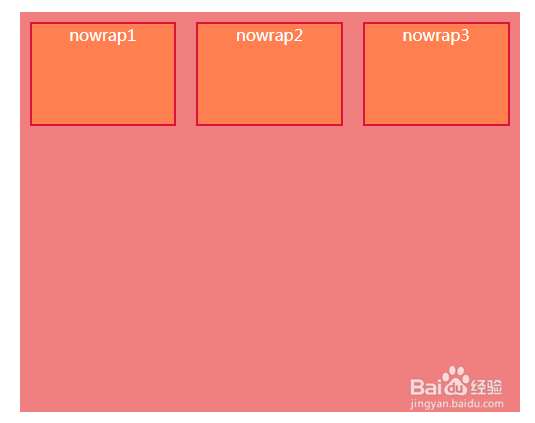
nowrap 是flex-wrap的 默认值,弹性容器为单行。该情况下弹性子项可能会溢出容器
例子:
css部分:
.father1{
width:500px;
height:400px;
background: lightcoral;
margin:20px auto;
display: -webkit-flex;
display:flex;
-webkit-flex-wrap:nowrap;
flex-wrap:nowrap;
}
.son1{
width:200px;
height:100px;
border:2px solid crimson;
background: coral;
margin:10px;
text-align: center;
color: #fff;
}
html部分:
<div class="father1">
<div class="son1">nowrap1</div>
<div class="son1">nowrap2</div>
<div class="son1">nowrap3</div>
</div>
效果如图:

2、flex-wrap:wrap ;
弹性容器为多行。该情况下弹性子项溢出的部分会被放置到新行,子项内部会发生断行。
例子:
css部分:
.father2{
width:500px;
height:400px;
background: lightcoral;
margin:20px auto;
display: -webkit-flex;
display:flex;
-webkit-flex-wrap:wrap;
flex-wrap:wrap;
}
.son2{
width:200px;
height:100px;
border:2px solid crimson;
background: coral;
margin:10px;
text-align: center;
color: #fff;
}
html部分:
<div class="father2">
<div class="son2">wrap1</div>
<div class="son2">wrap2</div>
<div class="son2">wrap3</div>
</div>
效果如图:


3、flex-wrap:wrap-reverse ;
与 wrap相反的排列方式。
例子:
css部分:
.father3{
width:500px;
height:400px;
background: lightcoral;
margin:20px auto;
display: -webkit-flex;
display:flex;
-webkit-flex-wrap: wrap-reverse;
flex-wrap: wrap-reverse;
}
.son3{
width:200px;
height:100px;
border:2px solid crimson;
background: coral;
margin:10px;
text-align: center;
color: #fff;
}
html部分:
<div class="father3">
<div class="son3">wrap-reverse1</div>
<div class="son3">wrap-reverse2</div>
<div class="son3">wrap-reverse3</div>
</div>
效果如图:

