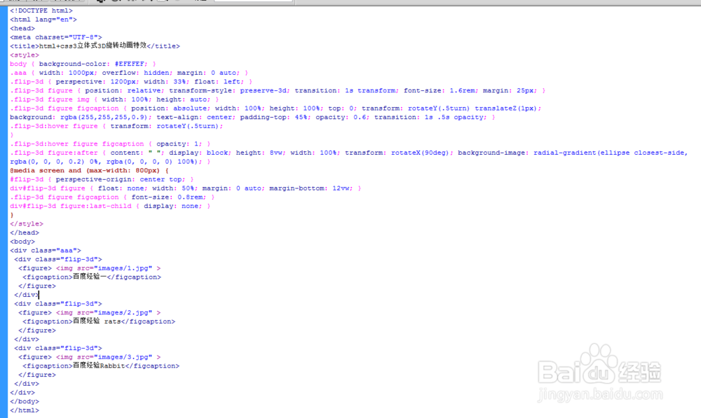
html+css3立体式3D旋转动画特效
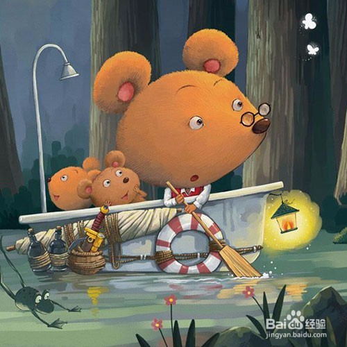
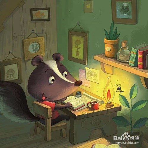
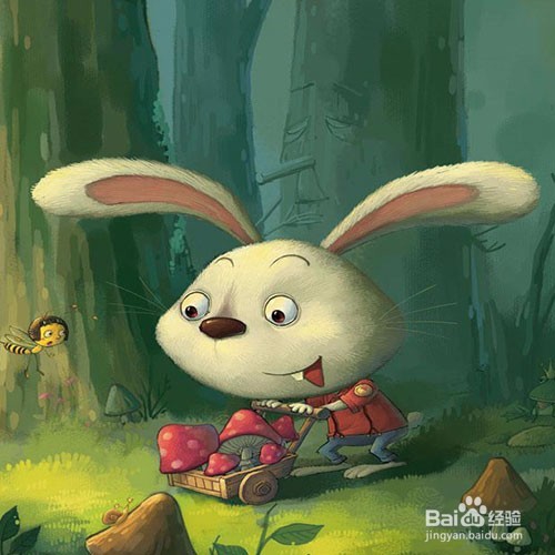
1、准备好需要用到的图标。
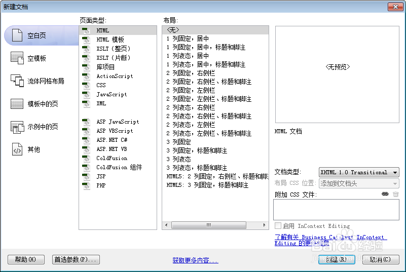
2、新建html文档。
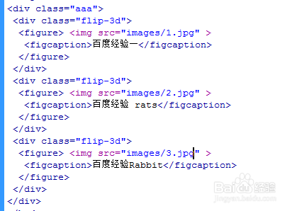
3、书写hmtl代码。
<div class="aaa">
<div class="flip-3d">
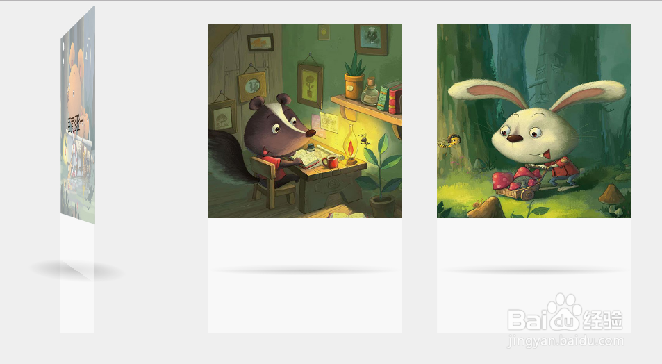
<figure> <img src="images/1.jpg" >
<figcaption>百度经验一</figcaption>
</figure>
</div>
<div class="flip-3d">
<figure> <img src="images/2.jpg" >
<figcaption>百度经验 rats</figcaption>
</figure>
</div>
<div class="flip-3d">
<figure> <img src="images/3.jpg" >
<figcaption>百度经验Rabbit</figcaption>
</figure>
</div>
</div>
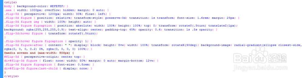
4、书写css代码。
<style>
body { background-color: #EFEFEF; }
.aaa { width: 1000px; overflow: hidden; margin: 0 auto; }
.flip-3d { perspective: 1200px; width: 33%; float: left; }
.flip-3d figure { position: relative; transform-style: preserve-3d; transition: 1s transform; font-size: 1.6rem; margin: 25px; }
.flip-3d figure img { width: 100%; height: auto; }
.flip-3d figure figcaption { position: absolute; width: 100%; height: 100%; top: 0; transform: rotateY(.5turn) translateZ(1px);
background: rgba(255,255,255,0.9); text-align: center; padding-top: 45%; opacity: 0.6; transition: 1s .5s opacity; }
.flip-3d:hover figure { transform: rotateY(.5turn);
}
.flip-3d:hover figure figcaption { opacity: 1; }
.flip-3d figure:after { content: " "; display: block; height: 8vw; width: 100%; transform: rotateX(90deg); background-image: radial-gradient(ellipse closest-side, rgba(0, 0, 0, 0.2) 0%, rgba(0, 0, 0, 0) 100%); }
@media screen and (max-width: 800px) {
#flip-3d { perspective-origin: center top; }
div#flip-3d figure { float: none; width: 50%; margin: 0 auto; margin-bottom: 12vw; }
.flip-3d figure figcaption { font-size: 0.8rem; }
div#flip-3d figure:last-child { display: none; }
}
</style>
5、代码整体结构。
6、查看效果。