CSS3弹性盒子之内容对齐justify-content
1、CSS3弹性盒子justify-content(内容对齐)属性应用在弹性容器上,把弹性项(子元素)沿着弹性容器的主轴线(main axis)对齐。
justify-content 语法:
justify-content: flex-start | flex-end | center | space-between | space-around
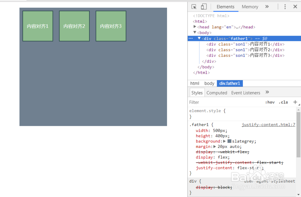
flex-start:默认值,弹性子元素向行头紧挨着填充。
例子:
css部分:
.father1{
width:500px;
height:400px;
background: slategrey;
margin:20px auto;
display: -webkit-flex;
display:flex;
-webkit-justify-content: flex-start;
justify-content: flex-start;
}
.son1{
width:100px;
height:100px;
border:2px solid darkslategray;
background: darkseagreen;
margin:10px;
line-height: 100px;
text-align: center;
color: #fff;
}
html部分:
<div class="father1">
<div class="son1">内容对齐1</div>
<div class="son1">内容对齐2</div>
<div class="son1">内容对齐3</div>
</div>
效果如图:
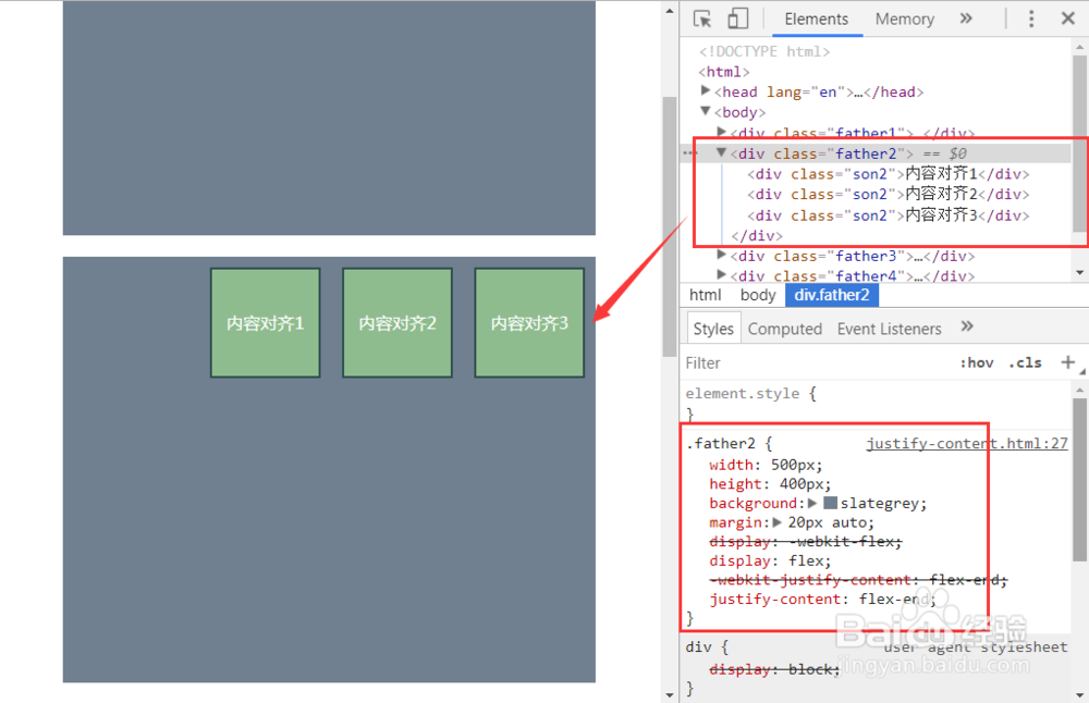
2、justify-content:flex-end;
弹性子元素向行尾紧挨着填充。第一个弹性子元素的main-end外边距边线被放置在该行的main-end边线,而后续弹性子元素依次平齐摆放。
例子:
css部分:
.father2{
width:500px;
height:400px;
background: slategrey;
margin:20px auto;
display: -webkit-flex;
display:flex;
-webkit-justify-content: flex-end;
justify-content: flex-end;
}
.son2{
width:100px;
height:100px;
border:2px solid darkslategray;
background: darkseagreen;
margin:10px;
line-height: 100px;
text-align: center;
color: #fff;
}
html部分:
<div class="father2">
<div class="son2">内容对齐1</div>
<div class="son2">内容对齐2</div>
<div class="son2">内容对齐3</div>
</div>
效果如图:
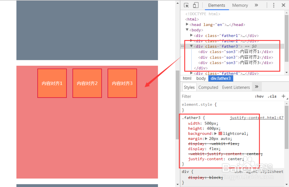
3、justify-content:center;
弹性项目居中紧挨着填充。但是如果剩余的自由空间是负的,则弹性项目将在两个方向上同时溢出。
例子:
css部分:
.father3{
width:500px;
height:400px;
background: lightcoral;
margin:20px auto;
display: -webkit-flex;
display:flex;
-webkit-justify-content: center;
justify-content: center;
}
.son3{
width:100px;
height:100px;
border:2px solid crimson;
background: coral;
margin:10px;
line-height: 100px;
text-align: center;
color: #fff;
}
html部分:
<div class="father3">
<div class="son3">内容对齐1</div>
<div class="son3">内容对齐2</div>
<div class="son3">内容对齐3</div>
</div>
效果如图:
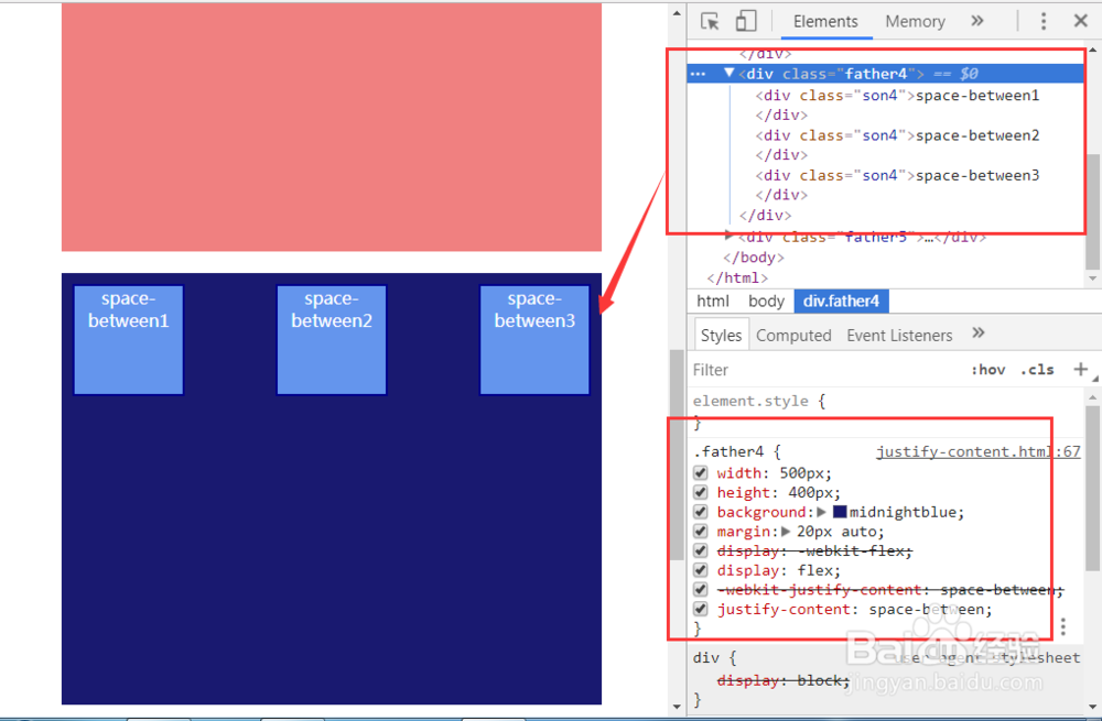
4、justify-content:space-between;
弹性项目平均分布在该行上。如果剩余空间为负或者只有一个弹性项,则该值等同于flex-start。否则,第1个弹性项的外边距和行的main-start边线对齐,而最后1个弹性项的外边距和行的main-end边线对齐,然后剩余的弹性项分布在该行上,相邻项目的间隔相等。
例子:
css部分:
.father4{
width:500px;
height:400px;
background: midnightblue;
margin:20px auto;
display: -webkit-flex;
display:flex;
-webkit-justify-content: space-between;
justify-content: space-between;
}
.son4{
width:100px;
height:100px;
border:2px solid darkblue;
background: cornflowerblue;
margin:10px;
text-align: center;
color: #fff;
}
html部分:
<div class="father4">
<div class="son4">space-between1</div>
<div class="son4">space-between2</div>
<div class="son4">space-between3</div>
</div>
效果如图:
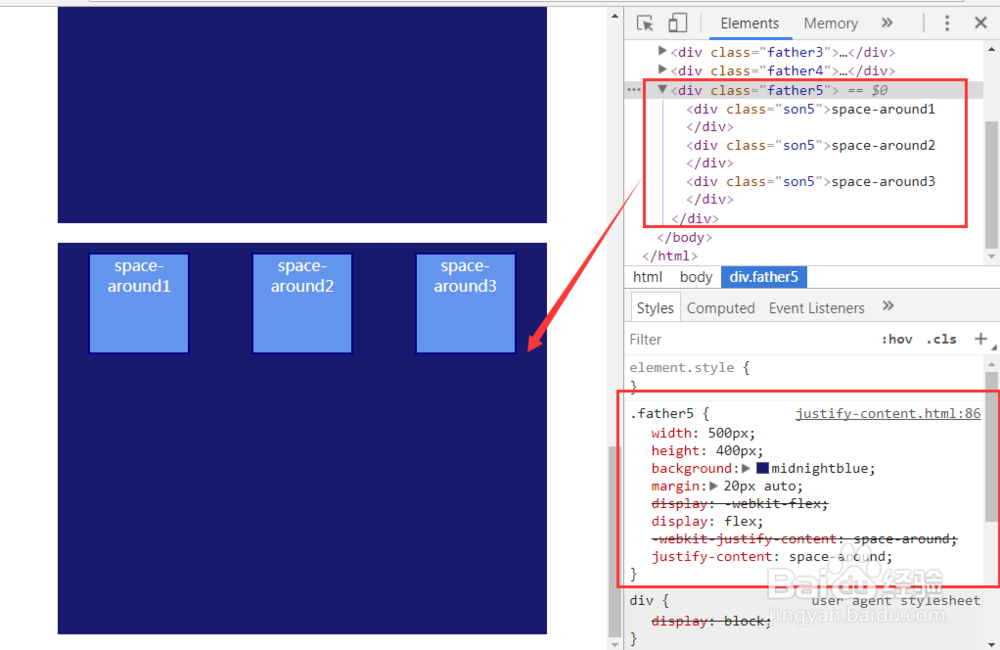
5、justify-content:space-around;
弹性项目平均分布在该行上,两边留有一半的间隔空间。如果剩余空间为负或者只有一个弹性项,则该值等同于center。否则,弹性项目沿该行分布,且彼此间隔相等(比如是20px),同时首尾两边和弹性容器之间留有一半的间隔(1/2*20px=10px)。
例子:
css部分:
.father5{
width:500px;
height:400px;
background: midnightblue;
margin:20px auto;
display: -webkit-flex;
display:flex;
-webkit-justify-content: space-around;
justify-content: space-around;
}
.son5{
width:100px;
height:100px;
border:2px solid darkblue;
background: cornflowerblue;
margin:10px;
text-align: center;
color: #fff;
}
html部分:
<div class="father5">
<div class="son5">space-around1</div>
<div class="son5">space-around2</div>
<div class="son5">space-around3</div>
</div>
效果如图: