html+css实现柱状图
1、新建html文档。

2、书写hmtl代码。
<ul id="q-graph">
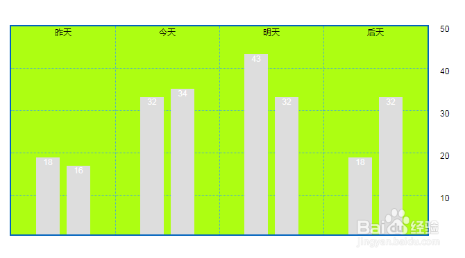
<li id="q1" class="qtr">昨天
<ul>
<li class="north bar" style="height:111px;">18</li>
<li class="south bar" style="height:99px;">16</li>
</ul>
</li>
<li id="q2" class="qtr">今天
<ul>
<li class="north bar" style="height:198px;">32</li>
<li class="south bar" style="height:210px;">34</li>
</ul>
</li>
<li id="q3" class="qtr">明天
<ul>
<li class="north bar" style="height:260px;">43</li>
<li class="救醒south bar" style="height:198px;">32</li>
</ul>
</li>
<li id="低祝倘q4" class="qtr">后天
<ul>
<li class="north bar" style="height:111px;">18</li>
<li class="south bar" style="height:198px;">32</li>
</ul>
</li>
<li id="ticks">
<div class="ticks">
<p>50</p>
</div>
<div class="ticks">
<p>40</p>
</div>
<div class="ticks">
<p>30</p>
</div>
<div class="ticks">
<p>20</p>
</div>
薪码 <div class="ticks">
<p>10</p>
</div>
</li>
</ul>

3、初始化css代码。
<style>
html, body { width : 100%; height : 100%; margin : 0; padding : 0; }
.wrapper { position : relative; width : 420px; margin : 0 auto; padding : 0; font-size : 0; }
.icon { position : relative; display : inline-block; width : 100px; height : 100px; margin : 20px; border-radius : 18px; -webkit-box-sizing : border-box; -moz-box-sizing : border-box; box-sizing : border-box; }
</style>

4、书写css代码。
<style>
body { padding: 0; margin: 40px; font-size: 9pt; font-family: Helvetica, Geneva, sans-serif; }
h3 { font-weight: normal; display: block; width: 600px; text-align: center; }
ul#q-graph { border: 2px solid #0063be; background: #adfe12; height: 300px !important; height: 304px; width: 600px; position: relative; list-style: none; margin: 1.1em 1em 3.5em; padding: 0; }
#q-graph li { position: absolute; text-align: center; bottom: 0; padding:0 margin:0;
}
li.qtr { width: 150px; height: 300px; border-right: 1px dotted #41a3e2; z-index: 2; }
li#q1 { left: 0; }
li#q2 { left: 150px; }
li#q3 { left: 300px; }
li#q4 { left: 450px; border-right: none; }
#q-graph ul { list-style: none; }
li.bar { width: 34px; color: #fff; }
li.north { left: 36px; background: #ddd; }
li.south { left: 80px; background: #ddd; }
li#ticks { left: 0; height: 300px; width: 100%; z-index: 1; }
div.ticks { position: relative; height: 60px; border-top: 1px dotted #41a3e2; }
div.ticks:first-child { border-top: none; }
div.ticks p { position: absolute; left: 103%; top: -11pt; }
</style>

5、代码整体结构。

6、查看效果。