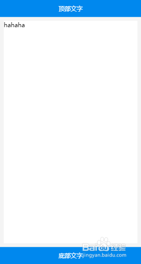
移动端布局上下固定中间自适应
1、第一步:定义主体结构
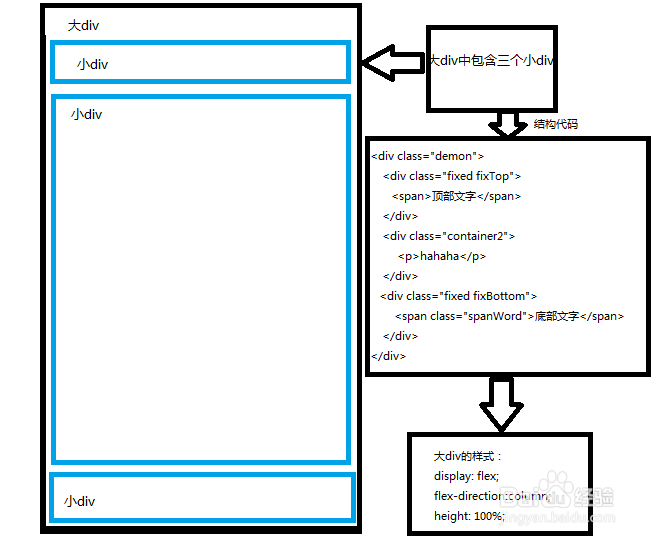
定义一个div中包含三个小div
大div样式:
display: flex;
flex-direction:column;
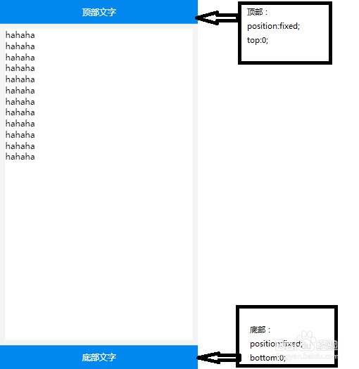
2、第二步:上下固定
顶部与底部样式 固定定位 position:fixed;
顶部top: 0px;
底部bottom: 0px;
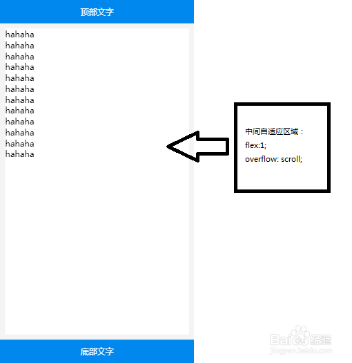
3、第三步:中间自适应
中间自适应区域样式
flex:1;
overflow: scroll;
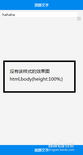
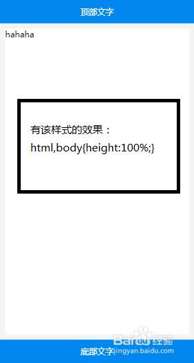
4、第四步:要在样式表中添加 html,body{height:100%;}
原因:让中间区域有个高度可以继承
5、第五步:完整代码
<!doctype html>
<html>
<head>
<meta charset="UTF-8">
<meta name="viewport" content="width=device-width, initial-scale=1.0">
<title>百度经验</title>
<style type="text/css">
*{
margin: 0;
padding: 0;
}
html,body{height:100%;}
body{
font-family: 微软雅黑;
background-color: #f4f4f4;
}
.demon{
display: flex;
flex-direction:column;
height: 100%;
}
.fixed{
width: 100%;
line-height: 45px;
font-size: 16px;
background-color: #0088ee;
color: #fff;
text-align: center;
position: fixed;
}
.fixTop{
top: 0px;
}
.fixBottom{
bottom: 0px;
}
.container2{
flex:1;
margin: 55px 10px ;
background-color: #fff;
overflow: scroll;
}
</style>
</head>
<body >
<div>
<div class="fixed fixTop">
<span>顶部文字</span>
</div>
<div>
hahaha
</div>
<div class="fixed fixBottom">
<span>底部文字</span>
</div>
</div>
</body>
</html>