html5+css3书写js中的影藏展开特效
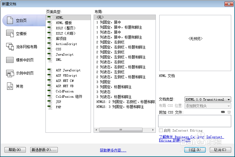
1、新建html文档。
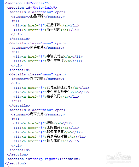
2、书写hmtl代码。
<section id="conter">
<section id="help-left">
<details class="menu" open>
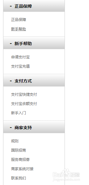
<summary>正品保障</summary>
<ul>
<li><a href="#">正品保障</a></li>
<li><a href="#">新手帮助</a></li>
</ul>
</details>
<details class="menu" open>
<summary>新手帮助</summary>
<ul>
<li><a href="#">申请支付宝</a></li>
<li><a href="#">支付宝充值</a></li>
</ul>
</details>
<details class="menu" open>
<summary>支付方式</summary>
<ul>
<li><a href="#">支付宝快捷支付</a></li>
<li><a href="#">支付宝余额支付</a></li>
<li><a href="#">新手入门</a></li>
</ul>
</details>
<details class="menu" open>
<summary>商家支持</summary>
<ul>
<li><a href="#">规则</a></li>
<li><a href="#">国际招商</a></li>
<li><a href="#">服务商招募</a></li>
<li><a href="#">商家系统对接</a></li>
<li><a href="#">联系我们</a></li>
</ul>
</details>
</section>
<section id="help-right"></section>
</section>
3、初始化css代码。
<style>
* { margin: 0; padding: 0 }
a { text-decoration: none }
#conter { width: 1000px; margin: auto }
#help-left { width: 200px; font-family: 'microsoft YaHei'; float: left }
</style>

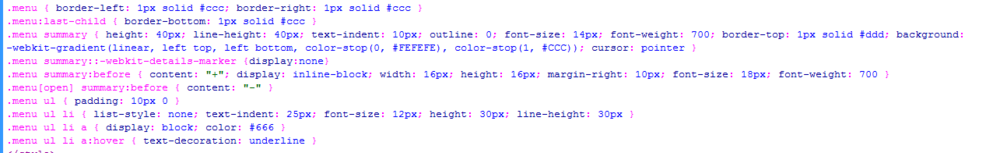
4、书写css代码。
<style>
.menu { border-left: 1px solid #ccc; border-right: 1px solid #ccc }
.menu:last-child { border-bottom: 1px solid #ccc }
.menu summary { height: 40px; line-height: 40px; text-indent: 10px; outline: 0; font-size: 14px; font-weight: 700; border-top: 1px solid #ddd; background: -webkit-gradient(linear, left top, left bottom, color-stop(0, #FEFEFE), color-stop(1, #CCC)); cursor: pointer }
.menu summary::-webkit-details-marker {display:none}
.menu summary:before { content: "+"; display: inline-block; width: 16px; height: 16px; margin-right: 10px; font-size: 18px; font-weight: 700 }
.menu[open] summary:before { content: "-" }
.menu ul { padding: 10px 0 }
.menu ul li { list-style: none; text-indent: 25px; font-size: 12px; height: 30px; line-height: 30px }
.menu ul li a { display: block; color: #666 }
.menu ul li a:hover { text-decoration: underline }
</style>
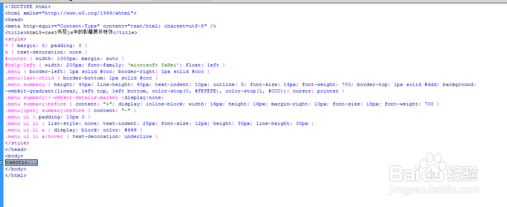
5、代码整体结构。
6、查看效果。