如何实现带有阴影的双CSS边框
1、首先请在你的编辑器里面新建一个Html文件
2、其次编写Html代码,我们这里使用了温庭筠的《南歌子词二首》中的一句经典诗作为我们今天的素材。
<div id="box">
玲珑骰子安红豆,入骨相思知不知。
</div>

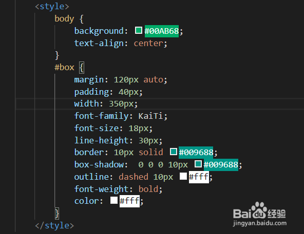
3、然后我们来编写对应的CSS代码
<style>
body {
background: #00AB68;
text-align: center;
}
#box {
margin: 120px auto;
padding: 40px;
width: 350px;
font-family: KaiTi;
font-size: 18px;
line-height: 30px;
border: 10px solid #009688;
box-shadow: 0 0 0 10px #009688;
outline: dashed 10px #fff;
font-weight: bold;
color: #fff;
}
</style>
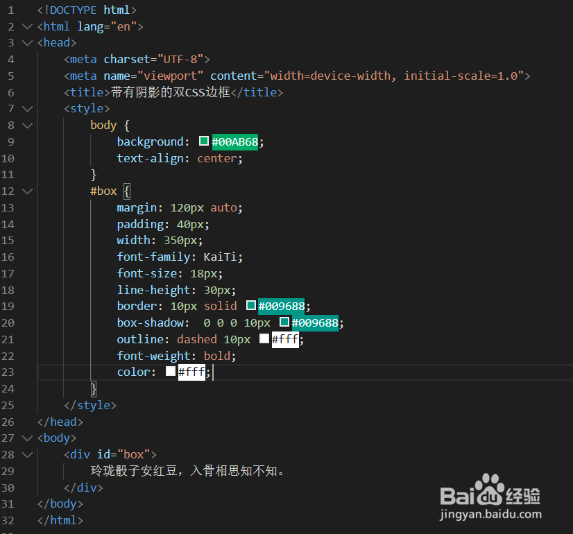
4、以下是完整代码,拷贝到编辑器即可使用
<!DOCTYPE html>
<html lang="en">
<head>
<meta charset="UTF-8">
<meta name="viewport" content="width=device-width, initial-scale=1.0">
<title>带有阴影的双CSS边框</title>
<style>
body {
background: #00AB68;
text-align: center;
}
#box {
margin: 120px auto;
padding: 40px;
width: 350px;
font-family: KaiTi;
font-size: 18px;
line-height: 30px;
border: 10px solid #009688;
box-shadow: 0 0 0 10px #009688;
outline: dashed 10px #fff;
font-weight: bold;
color: #fff;
}
</style>
</head>
<body>
<div id="box">
玲珑骰子安红豆,入骨相思知不知。
</div>
</body>
</html>
5、最后我们来看看在游览器中的效果吧
