input range 拖拽过后颜色用法
1、先将代码给大家:
首先CSS:
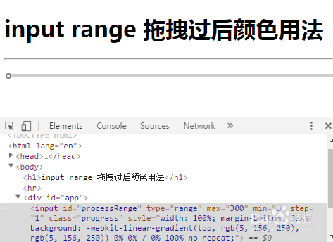
修改input range的样式问题:代码如下(建议直接ctrl+V):
.progress{
width: 100%;
height: 40px;
}
input[type=range] {/*input外壳样式*/
-webkit-appearance: none;
border-radius: 10px;
height: 5px;
z-index: 10;
}
input[type=range]::-webkit-slider-runnable-track {/*轨道*/
height: 5px;
background: rgba(0,0,0,0.2);
border-radius: 10px;
}
input[type=range]::-webkit-slider-thumb {/*滑块*/
-webkit-appearance: none;
height: 8px;
width: 8px;
margin-top: -1px;
background: #ffffff !important;
border-radius: 50%;
}
改完之后如下图所示:
2、其次HTML(用到了vue!!!)
<div id="app">
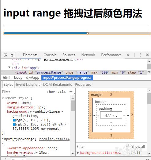
<input id="processRange" class="progress" type="range" :value="processPoint" :max ="duration" min ="0" step="1" @input = "changeProcess();" style="width: 100%;margin-bottom:3px;" :style="{background: '-webkit-linear-gradient(top, #059CFA, #059CFA) 0% 0% / '+ processPoint*100/duration +'% 100% no-repeat'}">
</div>

3、其次JS代码:
var app = new Vue({
el: '#app',
data: {
processPoint:0,
duration:'300' //input range总分段
},
methods: {
changeProcess: function() {
var range = document.getElementById('processRange');
this.processPoint = range.value;
console.log(range.value);
},
}
});
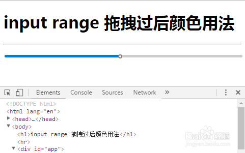
最终的效果如下:
4、用到的知识:
1:html的<input type="range">拖拽时会触发oninput事件
2:css3 的
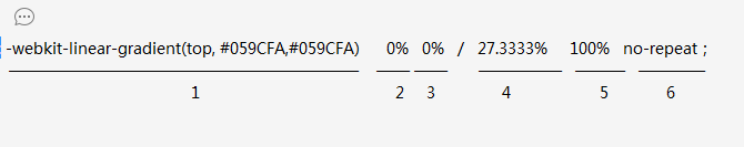
background的渐变与backgroud-size;最后渲染为:
background: -webkit-linear-gradient(top, rgb(5, 156, 250), rgb(5, 156, 250)) 0% 0% / 27% 100% no-repeat;
解释一下各个参数如下图:
部分1: -webkit-linear-gradient(top, rgb(5, 156, 250), rgb(5, 156, 250))
表示:渐变参数,从上到下开始渐变,从rgb(5, 156, 250)到rgb(5, 156, 250)变颜色,
部分2:0% 0% 从左上角的(0%,0%)开始填充颜色
部分3: 27% 100% 到整个而input的(27%,100%)填充颜色结束。
然后通过计算修改部分3中 27%的值来改变填充长度。
5、3:js代码:每次 oninput 即 拖拽时获取 input value 的值。
var range = document.getElementById('processRange');
this.processPoint = range.value;
计算百分长度 processPoint*100/duration
processPoint为拖拽过得长度,duration 为总长度
最后鲜果如图。