如何改变checkbox的样式
1、第一步演示如何使用checkbox
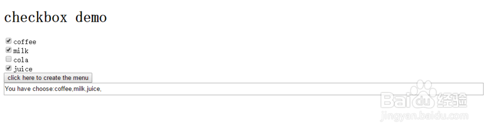
在<form></form>标签内使用<input type="checkbox" name=" " value=" " id=" ">编辑一组checkbox,通过name获取checkbox数组。根据状态,获得数值。
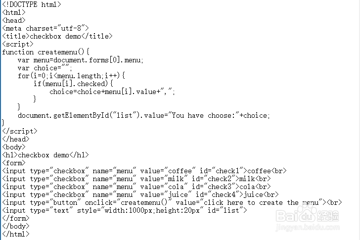
<!DOCTYPE html>
<html>
<head>
<meta charset="utf-8">
<title>checkbox demo</title>
<script>
function createmenu(){
var menu=document.forms[0].menu;
var choice="";
for(i=0;i<menu.length;i++){
if(menu[i].checked){
choice=choice+menu[i].value+",";
}
}
document.getElementById("list").value="You have choose:"+choice;
}
</script>
</head>
<body>
<h1>checkbox demo</h1>
<form>
<input type="checkbox" name="menu" value="coffee" id="check1">coffee<br>
<input type="checkbox" name="menu" value="milk" id="check2">milk<br>
<input type="checkbox" name="menu" value="cola" id="check3">cola<br>
<input type="checkbox" name="menu" value="juice" id="check4">juice<br>
<input type="button" onclick="createmenu()" value="click here to create the menu"><br>
<input type="text" style="width:1000px;height:20px" id="list">
</form>
</body>
</html>
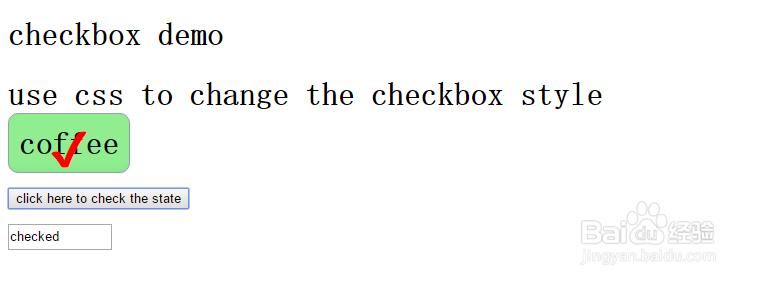
2、对一个checkbox的模式可以通过改变和设置。
<style type="text/css">
.checkboxmode1{display:none;}
/*******STYLE 1*******/
.checkboxmode1 + label {
background-color: lightblue;
border: 1px solid #C1CACA;
box-shadow: 0 1px 2px rgba(0, 0, 0, 0.05), inset 0px -15px 10px -12px rgba(0, 0, 0, 0.05);
padding: 10px;
border-radius: 10px;
display: inline-block;
position: relative;
margin-right: 30px;}
.checkboxmode1 + label:active {
box-shadow: 0 1px 2px rgba(0,0,0,0.05), inset 0px 1px 3px rgba(0,0,0,0.1);}
.checkboxmode1:checked + label {
background-color: lightgreen;
border: 1px solid #92A1AC;
box-shadow: 0 1px 2px rgba(0, 0, 0, 0.05), inset 0px -15px 10px -12px rgba(0, 0, 0, 0.05), inset 15px 10px -12px rgba(255, 255, 255, 0.1);
color: black;}
.checkboxmode1:checked + label:after{
content: '\2714';
position: absolute;
top: 0px;
left: 0px;
color: red;
width: 100%;
text-align: center;
font-size: 1.5em;
padding: 1px 0 0 0;
vertical-align: text-top;
}
</style>
通过设置checkbox在点击和未点击是的状态设置其模式。必须先将checkbox隐藏。display:none;


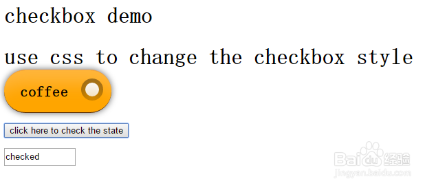
3、接下来演示其他样式:
<style type="text/css">
.checkboxmode2{display:none;}
/*******STYLE 2*******/
.checkboxmode2 + label {
background-color: orange;
padding: 18px 20px 18px 23px;
box-shadow: inset 0 50px 37px -30px rgba(255, 222, 197, 0.3), 0 0 13px rgba(0, 0, 0, 0.6);
border-radius: 1000px;
display: inline-block;
position: relative;
border-top: 1px solid #ECA14F;
margin-right: 30px;
color: black;
font-size: 0.7em;
width: 113px;
text-shadow: 0 1px 0 rgba(0, 0, 0, 0.2);
border-bottom: 1px solid #552B09;
}
.checkboxmode2 + label:hover {
border-top: 1px solid #FC8C1E;
background: #FC8C1E;
box-shadow: inset 0 -50px 37px -30px rgba(255, 222, 197, 0.07), 0 0 13px rgba(0, 0, 0, 0.6);
}
.checkboxmode2 + label:active {
border-top: none;
background: #FC8C1E;
padding: 19px 20px 18px 23px;
box-shadow: inset 0 3px 8px rgba(129, 69, 13, 0.3), inset 0 -50px 37px -30px rgba(255, 222, 197, 0.07), 0 0 13px rgba(0, 0, 0, 0.6);
}
.checkboxmode2 + label:after {
content: ' ';
border-radius: 100px;
width: 32px;
position: absolute;
top: 12px;
right: 12px;
box-shadow: inset 0px 16px 40px rgba(0, 0, 0, 0.4);
height: 32px;
}
.checkboxmode2 + label:before {
content: ' ';
border-radius: 100px;
width: 20px;
position: absolute;
top: 18px;
right: 18px;
z-index: 999;
box-shadow: inset 0px 16px 40px #FFF;
height: 20px;
display: none;
}
.checkboxmode2:checked + label:before {
display: block;
}
</style>
<script>
function check(){
if(document.getElementById("checkbox1").checked){
document.getElementById("state").value="checked";
}else{
document.getElementById("state").value="unchecked";
}
}
</script>

4、<style type="text/css">
.checkboxmode3{display:none;}
/*******STYLE 3*******/
.checkboxmode3 + label {
background-color: #fafbfa;
padding: 9px;
border-radius: 50px;
display: inline-block;
position: relative;
margin-right: 30px;
-webkit-transition: all 0.1s ease-in;
transition: all 0.1s ease-in;
width: 40px;
height: 15px;
}
.checkboxmode3 + label:after {
content: ' ';
position: absolute;
top: 0;
-webkit-transition: box-shadow 0.1s ease-in;
transition: box-shadow 0.1s ease-in;
left: 0;
width: 100%;
height: 100%;
border-radius: 100px;
box-shadow: inset 0 0 0 0 #eee, 0 0 1px rgba(0,0,0,0.4);
}
.checkboxmode3 + label:before {
content: ' ';
position: absolute;
background: white;
top: 1px;
left: 1px;
z-index: 999999;
width: 31px;
-webkit-transition: all 0.1s ease-in;
transition: all 0.1s ease-in;
height: 31px;
border-radius: 100px;
box-shadow: 0 3px 1px rgba(0,0,0,0.05), 0 0px 1px rgba(0,0,0,0.3);
}
.checkboxmode3:active + label:after {
box-shadow: inset 0 0 0 20px #eee, 0 0 1px #eee;
}
.checkboxmode3:active + label:before {
width: 37px;
}
.checkboxmode3:checked:active + label:before {
width: 37px;
left: 20px;
}
.checkboxmode3 + label:active {
box-shadow: 0 1px 2px rgba(0,0,0,0.05), inset 0px 1px 3px rgba(0,0,0,0.1);
}
.checkboxmode3:checked + label:before {
content: ' ';
position: absolute;
left: 26px;
border-radius: 100px;
}
.checkboxmode3:checked + label:after {
content: ' ';
font-size: 1.5em;
position: absolute;
background: #4cda60;
box-shadow: 0 0 1px #4cda60;
}
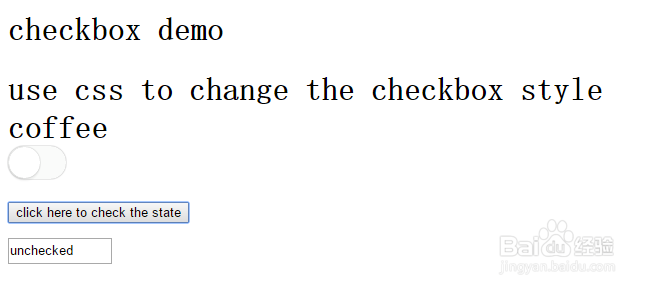
这个复选框一般用于移动客户端的开发,属于App应用。

5、.checkboxmode4{display:none;}
/*******STYLE 4*******/
.checkboxmode4 + label {
background-color: #FFF;
padding: 11px 9px;
border-radius: 7px;
display: inline-block;
position: relative;
margin-right: 30px;
background: #F7836D;
width: 58px;
height: 10px;
box-shadow: inset 0 0 20px rgba(0, 0, 0, 0.1), 0 0 10px rgba(245, 146, 146, 0.4);
}
.checkboxmode4 + label:before {
content: ' ';
position: absolute;
background: #FFF;
top: 0px;
z-index: 99999;
left: 0px;
width: 24px;
color: lightgreen;
height: 32px;
border-radius: 7px;
box-shadow: 0 0 1px rgba(0,0,0,0.6);
}
.checkboxmode4 + label:after {
content: 'off';
position: absolute;
top: 7px;
left: 37px;
font-size: 0.5em;
color: white;
font-weight: bold;
left: 8px;
padding: 5px;
top: 4px;
border-radius: 100px;
}
.checkboxmode4:checked + label {
background: #67A5DF;
box-shadow: inset 0 0 20px rgba(0, 0, 0, 0.1), 0 0 10px rgba(146, 196, 245, 0.4);
}
.checkboxmode4:checked + label:after {
content: 'on';
left: 10px;
}
.checkboxmode4:checked + label:before {
content: ' ';
position: absolute;
z-index: 99999;
left: 52px;
}
.checkboxmode4 + label:after {
left: 35px;
}
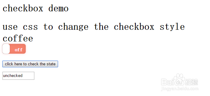
演示一个可以拖动的复选框

6、以上例子说明,先构建一个类,指定背景颜色background-color,复选框的形状等,或者样式,前提是将默认复选框隐藏。这样设置格式。才能比较好的使用。