CSS3实现3D人物行走走路动画
1、新建html文档。

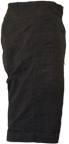
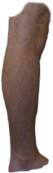
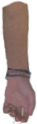
2、准备好需要用到的人体部位图标。


3、书写hmtl代码。
<div id="canvas">
<div class="sky">
<div class="cloud-1"></div>
<div class="cloud-2"></div>
<div class="cloud-3"></div>
<div class="cloud-4"></div>
<div class="cloud-5"></div>
<div class="cloud-6"></div>
<div class="cloud-7"></div>
<div class="cloud-8"></div>
</div>
<div class="horizon"></div>
<div class="ground">
<div class="sign-best"></div>
<div class="sign-no-js"></div>
<div class="sign-lots-of-divs"></div>
<div class="sign-all-css"></div>
</div>
<!-- skeleton and shadow -->
<div class="shadow"></div>
<div class="me">
<div class="torso">
<div class="left leg">
<div class="left thigh">
<div class="left shin">
<div class="left foot">
<div class="left toes"></div>
</div>
</div>
</div>
</div>
<!-- left leg -->
<div class="right leg">
<div class="right thigh">
<div class="right shin">
<div class="right foot">
<div class="right toes"></div>
</div>
</div>
</div>
</div>
<!-- right leg -->
<div class="left arm">
<div class="left bicep">
<div class="left forearm"></div>
</div>
</div>
<!-- left arm -->
<div class="right arm">
<div class="right bicep">
<div class="right forearm"></div>
</div>
</div>
<!-- right arm -->
</div>
<!-- torso -->
</div>
<!-- me -->
<div class="overlay"></div>
</div>

4、书写css代码。
#canvas { height: 600px; width: 760px; margin: 0; padding: 0; position: relative; overflow: hidden; }
#canvas div { position: absolute; -webkit-iteration-count: infinite; -moz-iteration-count: infinite; -ms-iteration-count: infinite; -o-iteration-count: infinite; animation-iteration-count: infinite; -webkit-timing-function: linear; -moz-timing-function: linear; -ms-timing-function: linear; -o-timing-function: linear; animation-timing-function: linear; }
#canvas:target div:not(.overlay) { border: 1px solid black; }
#canvas:target div.me div { background: rgba(255, 255, 255, 0.25); }
.me { top: 50px; left: 350px; -webkit-name: me; -moz-name: me; -ms-name: me; -o-name: me; animation-name: me; }
.me, .me div { background-repeat: no-repeat; -webkit-duration: 1750ms; -moz-duration: 1750ms; -ms-duration: 1750ms; -o-duration: 1750ms; animation-duration: 1750ms; }
.torso { width: 86px; height: 275px; background-image: url(../images/me/torso.png); }
.arm { left: 12px; -webkit-transform-origin: 20px 10px; -moz-transform-origin: 20px 10px; -ms-transform-origin: 20px 10px; -o-transform-origin: 20px 10px; transform-origin: 20px 10px; }
.right.arm { top: 93px; -webkit-name: right-bicep; -moz-name: right-bicep; -ms-name: right-bicep; -o-name: right-bicep; animation-name: right-bicep; }
.left.arm { top: 87px; -webkit-name: left-bicep; -moz-name: left-bicep; -ms-name: left-bicep; -o-name: left-bicep; animation-name: left-bicep; }
.bicep { height: 124px; width: 51px; }
.right.bicep { background-image: url(../images/me/right-bicep.png); }
.left.bicep { background-image: url(../images/me/left-bicep.png); }
.forearm { top: 108px; left: 14px; width: 36px; height: 121px; -webkit-transform-origin: 3px 7px; -moz-transform-origin: 3px 7px; -ms-transform-origin: 3px 7px; -o-transform-origin: 3px 7px; transform-origin: 3px 7px; }
.right.forearm { background-image: url(../images/me/right-forearm.png); -webkit-name: right-forearm; -moz-name: right-forearm; -ms-name: right-forearm; -o-name: right-forearm; animation-name: right-forearm; }
.left.forearm { background-image: url(../images/me/left-forearm.png); -webkit-name: left-forearm; -moz-name: left-forearm; -ms-name: left-forearm; -o-name: left-forearm; animation-name: left-forearm; }
.leg { left: 6px; -webkit-transform-origin: 30px 20px; -moz-transform-origin: 30px 20px; -ms-transform-origin: 30px 20px; -o-transform-origin: 30px 20px; transform-origin: 30px 20px; -webkit-name: thigh; -moz-name: thigh; -ms-name: thigh; -o-name: thigh; animation-name: thigh; }
.right.leg { top: 235px; -webkit-name: right-thigh; -moz-name: right-thigh; -ms-name: right-thigh; -o-name: right-thigh; animation-name: right-thigh; }
.left.leg { top: 225px; -webkit-name: left-thigh; -moz-name: left-thigh; -ms-name: left-thigh; -o-name: left-thigh; animation-name: left-thigh; }
.thigh { width: 70px; height: 145px; }
.left.thigh { background-image: url(../images/me/left-thigh.png); }
.right.thigh { background-image: url(../images/me/right-thigh.png); }
.shin { top: 115px; width: 50px; height: 170px; background-image: url(../images/me/shin.png); -webkit-transform-origin: 30px 25px; -moz-transform-origin: 30px 25px; -ms-transform-origin: 30px 25px; -o-transform-origin: 30px 25px; transform-origin: 30px 25px; }
.right.shin { -webkit-name: right-shin; -moz-name: right-shin; -ms-name: right-shin; -o-name: right-shin; animation-name: right-shin; }
.left.shin { -webkit-name: left-shin; -moz-name: left-shin; -ms-name: left-shin; -o-name: left-shin; animation-name: left-shin; }
.foot { top: 155px; left: 2px; width: 67px; height: 34px; background-image: url(../images/me/foot.png); -webkit-transform-origin: 0 50%; -moz-transform-origin: 0 50%; -ms-transform-origin: 0 50%; -o-transform-origin: 0 50%; transform-origin: 0 50%; }
.right.foot { -webkit-name: right-foot; -moz-name: right-foot; -ms-name: right-foot; -o-name: right-foot; animation-name: right-foot; }
.left.foot { -webkit-name: left-foot; -moz-name: left-foot; -ms-name: left-foot; -o-name: left-foot; animation-name: left-foot; }
.toes { top: 9px; left: 66px; width: 28px; height: 25px; background-image: url(../images/me/toes.png); -webkit-transform-origin: 0% 100%; -moz-transform-origin: 0% 100%; -ms-transform-origin: 0% 100%; -o-transform-origin: 0% 100%; transform-origin: 0% 100%; }
.right.toes { -webkit-name: right-toes; -moz-name: right-toes; -ms-name: right-toes; -o-name: right-toes; animation-name: right-toes; }
.left.toes { -webkit-name: left-toes; -moz-name: left-toes; -ms-name: left-toes; -o-name: left-toes; animation-name: left-toes; }
.shadow { width: 200px; height: 70px; left: 270px; bottom: 5px; background-image: url(../images/misc/shadow.png); -webkit-name: shadow; -moz-name: shadow; -ms-name: shadow; -o-name: shadow; animation-name: shadow; }

5、代码整体结构。

6、查看效果。
