html5+css3唯美loading加载动画效果
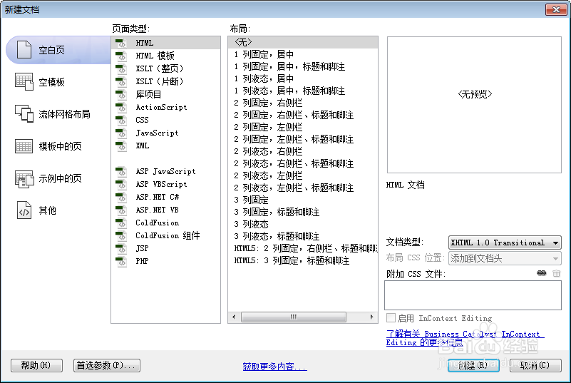
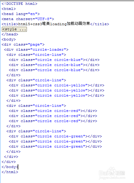
1、新建html文档。
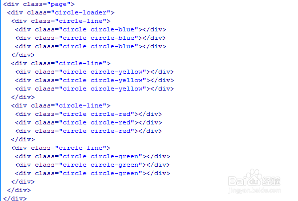
2、书写hmtl代码。
<div class="page">
<div class="circle-loader">
<div class="circle-line">
<div class="circle circle-blue"></div>
<div class="circle circle-blue"></div>
<div class="circle circle-blue"></div>
</div>
<div class="circle-line">
<div class="circle circle-yellow"></div>
<div class="circle circle-yellow"></div>
<div class="circle circle-yellow"></div>
</div>
<div class="circle-line">
<div class="circle circle-red"></div>
<div class="circle circle-red"></div>
<div class="circle circle-red"></div>
</div>
<div class="circle-line">
<div class="circle circle-green"></div>
<div class="circle circle-green"></div>
<div class="circle circle-green"></div>
</div>
</div>
</div>
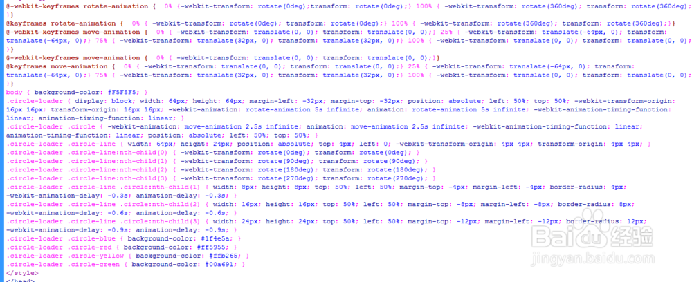
3、书写css代码。
<style>
@-webkit-keyframes rotate-animation { 0% {-webkit-transform: rotate(0deg);transform: rotate(0deg);} 100% { -webkit-transform: rotate(360deg); transform: rotate(360deg);}}
@keyframes rotate-animation { 0% { -webkit-transform: rotate(0deg); transform: rotate(0deg);} 100% { -webkit-transform: rotate(360deg); transform: rotate(360deg);}}
@-webkit-keyframes move-animation { 0% { -webkit-transform: translate(0, 0); transform: translate(0, 0);} 25% { -webkit-transform: translate(-64px, 0); transform: translate(-64px, 0);} 75% { -webkit-transform: translate(32px, 0); transform: translate(32px, 0);} 100% { -webkit-transform: translate(0, 0); transform: translate(0, 0);}}
@-webkit-keyframes move-animation { 0% { -webkit-transform: translate(0, 0); transform: translate(0, 0);}}
@keyframes move-animation { 0% { -webkit-transform: translate(0, 0); transform: translate(0, 0);} 25% { -webkit-transform: translate(-64px, 0); transform: translate(-64px, 0);} 75% { -webkit-transform: translate(32px, 0); transform: translate(32px, 0);} 100% { -webkit-transform: translate(0, 0); transform: translate(0, 0);}}
body { background-color: #F5F5F5; }
.circle-loader { display: block; width: 64px; height: 64px; margin-left: -32px; margin-top: -32px; position: absolute; left: 50%; top: 50%; -webkit-transform-origin: 16px 16px; transform-origin: 16px 16px; -webkit-animation: rotate-animation 5s infinite; animation: rotate-animation 5s infinite; -webkit-animation-timing-function: linear; animation-timing-function: linear; }
.circle-loader .circle { -webkit-animation: move-animation 2.5s infinite; animation: move-animation 2.5s infinite; -webkit-animation-timing-function: linear; animation-timing-function: linear; position: absolute; left: 50%; top: 50%; }
.circle-loader .circle-line { width: 64px; height: 24px; position: absolute; top: 4px; left: 0; -webkit-transform-origin: 4px 4px; transform-origin: 4px 4px; }
.circle-loader .circle-line:nth-child(0) { -webkit-transform: rotate(0deg); transform: rotate(0deg); }
.circle-loader .circle-line:nth-child(1) { -webkit-transform: rotate(90deg); transform: rotate(90deg); }
.circle-loader .circle-line:nth-child(2) { -webkit-transform: rotate(180deg); transform: rotate(180deg); }
.circle-loader .circle-line:nth-child(3) { -webkit-transform: rotate(270deg); transform: rotate(270deg); }
.circle-loader .circle-line .circle:nth-child(1) { width: 8px; height: 8px; top: 50%; left: 50%; margin-top: -4px; margin-left: -4px; border-radius: 4px; -webkit-animation-delay: -0.3s; animation-delay: -0.3s; }
.circle-loader .circle-line .circle:nth-child(2) { width: 16px; height: 16px; top: 50%; left: 50%; margin-top: -8px; margin-left: -8px; border-radius: 8px; -webkit-animation-delay: -0.6s; animation-delay: -0.6s; }
.circle-loader .circle-line .circle:nth-child(3) { width: 24px; height: 24px; top: 50%; left: 50%; margin-top: -12px; margin-left: -12px; border-radius: 12px; -webkit-animation-delay: -0.9s; animation-delay: -0.9s; }
.circle-loader .circle-blue { background-color: #1f4e5a; }
.circle-loader .circle-red { background-color: #ff5955; }
.circle-loader .circle-yellow { background-color: #ffb265; }
.circle-loader .circle-green { background-color: #00a691; }
</style>
4、代码整体结构。
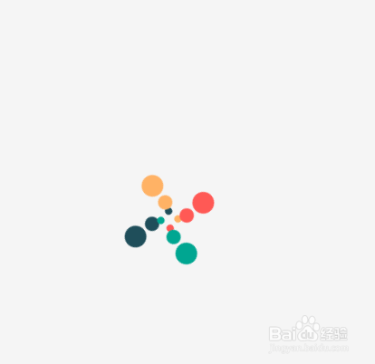
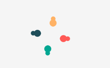
5、查看效果,。