Matlab饼状图的制作
1、首先给出一列数据:
X = [1 3 0.5 2.5 2];
pie(X)
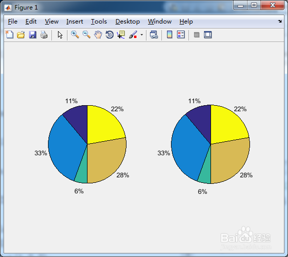
其得到的结果与下面的结果一致:
Y = X/sum(X)
subplot(1,2,1);
pie(X);
subplot(1,2,2);
pie(Y);

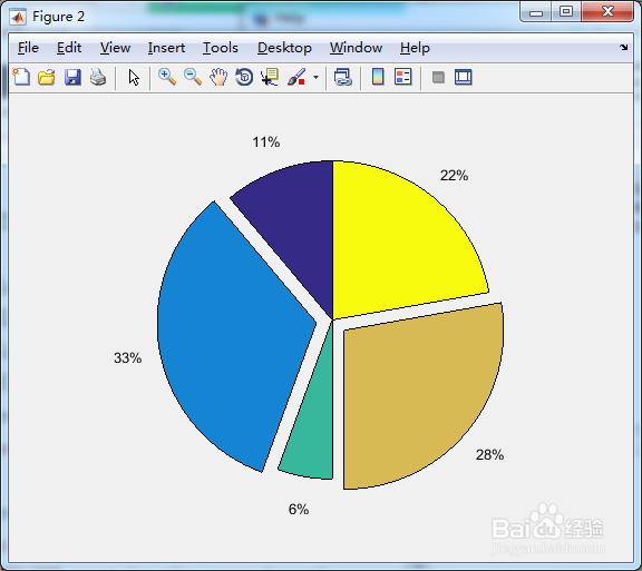
2、可以将几角饼分开:
explode = [0 1 0 1 0];
figure; pie(X,explode)
explode中的1表示从大饼中脱离开来。
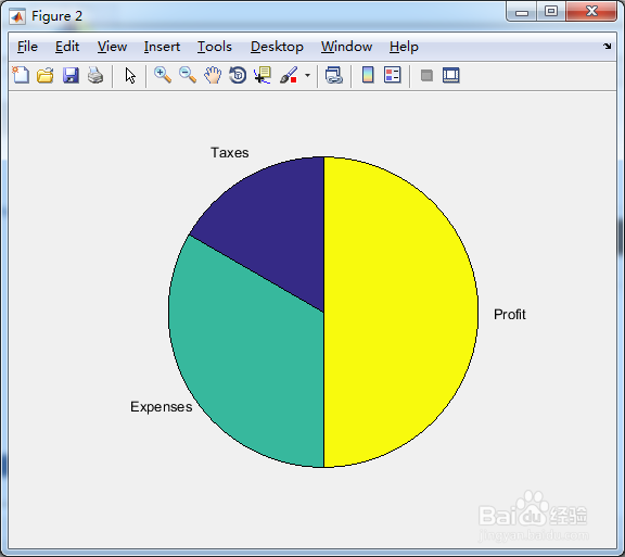
3、当然也可以在每一角饼上填充它所代表的内容:
X = 1:3;
labels = {'Taxes','Expenses','Profit'};
pie(X,labels)
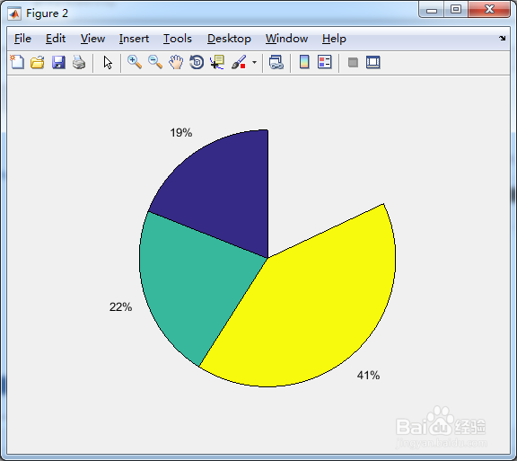
4、如果要作图的数据总和不足1的话,将会出现缺角的情况:
X = [0.19 0.22 0.41];
pie(X)
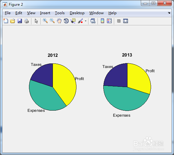
5、将两个周期的数据放在一起,便于对比:
X = [0.2 0.4 0.4];
labels = {'Taxes','Expenses','Profit'};
ax1 = subplot(1,2,1);
pie(ax1,X,labels)
title(ax1,'2012');
Y = [0.24 0.46 0.3];
ax2 = subplot(1,2,2);
pie(ax2,Y,labels)
title(ax2,'2013');
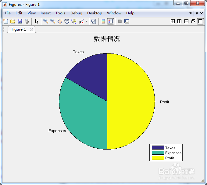
6、当然还可以添加其他的图件的内容:
h = pie(X,labels);
title('数据情况','fontsize',16);
legend('Taxes','Expenses','Profit');
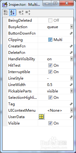
返回的h的句柄见下图,可自行修改。
声明:本网站引用、摘录或转载内容仅供网站访问者交流或参考,不代表本站立场,如存在版权或非法内容,请联系站长删除,联系邮箱:site.kefu@qq.com。
阅读量:40
阅读量:94
阅读量:184
阅读量:91
阅读量:52