Css3向上滚动动画
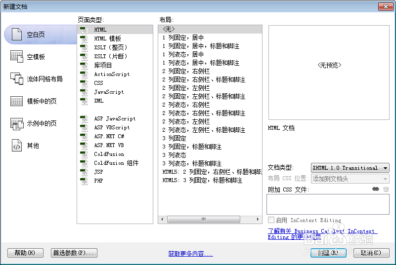
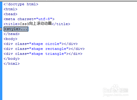
1、新建html文档。
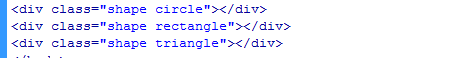
2、书写hmtl代码。
<div class="shape circle"></div>
<div class="shape rectangle"></div>
<div class="shape triangle"></div>
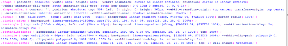
3、书写css代码。
.shape { position: absolute; width: 66px; height: 66px; -webkit-animation: circle 5s linear infinite; animation: circle 5s linear infinite; -webkit-animation-fill-mode: both; animation-fill-mode: both; box-shadow: 0 0 10px 0 rgba(0, 0, 0, 0.1); }
.shape::after { content: ''; position: absolute; top: 50%; left: 0; right: 0; height: 360px; -webkit-transform-origin: top center; transform-origin: top center; -webkit-animation: inherit; animation: inherit; -webkit-animation-name: shadow; animation-name: shadow; }
.circle { top: calc(100vh - 66px); left: calc(25vw - 66px); background: linear-gradient(45deg, #49E7C2 0%, #7AEC90 100%); border-radius: 100%; }
.circle::after { background: linear-gradient(-180deg, rgba(73, 231, 194, 0.4) 0%, rgba(28, 28, 28, 0) 100%); }
.rectangle { top: calc(100vh - 66px); left: calc(50vw - 66px); background: linear-gradient(45deg, #EA9F45 0%, #F4EE51 100%); -webkit-animation-delay: 2s; animation-delay: 2s; }
.rectangle::after { background: linear-gradient(-180deg, rgba(234, 159, 69, 0.3) 0%, rgba(28, 28, 28, 0) 100%); top: 100%; }
.triangle { top: calc(100vh - 66px); left: calc(75vw - 66px); background: linear-gradient(45deg, #22A0F9 0%, #71FDC8 100%); -webkit-clip-path: polygon(0 0, 100% 100%, 100% 0); clip-path: polygon(0 0, 100% 100%, 100% 0); -webkit-animation-delay: 1s; animation-delay: 1s; }
.triangle::after { background: linear-gradient(-180deg, rgba(34, 223, 249, 0.4) 0%, rgba(28, 28, 28, 0) 100%); top: 0; will-change: transform; }
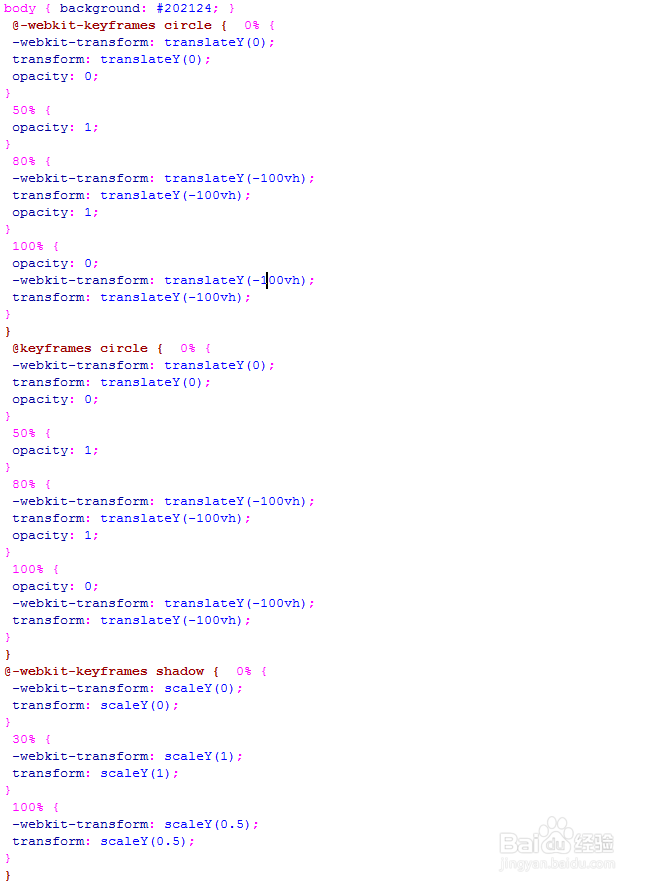
4、书写css3动画代码。
body { background: #202124; }
@-webkit-keyframes circle { 0% {
-webkit-transform: translateY(0);
transform: translateY(0);
opacity: 0;
}
50% {
opacity: 1;
}
80% {
-webkit-transform: translateY(-100vh);
transform: translateY(-100vh);
opacity: 1;
}
100% {
opacity: 0;
-webkit-transform: translateY(-100vh);
transform: translateY(-100vh);
}
}
@keyframes circle { 0% {
-webkit-transform: translateY(0);
transform: translateY(0);
opacity: 0;
}
50% {
opacity: 1;
}
80% {
-webkit-transform: translateY(-100vh);
transform: translateY(-100vh);
opacity: 1;
}
100% {
opacity: 0;
-webkit-transform: translateY(-100vh);
transform: translateY(-100vh);
}
}
@-webkit-keyframes shadow { 0% {
-webkit-transform: scaleY(0);
transform: scaleY(0);
}
30% {
-webkit-transform: scaleY(1);
transform: scaleY(1);
}
100% {
-webkit-transform: scaleY(0.5);
transform: scaleY(0.5);
}
}
@keyframes shadow { 0% {
-webkit-transform: scaleY(0);
transform: scaleY(0);
}
30% {
-webkit-transform: scaleY(1);
transform: scaleY(1);
}
100% {
-webkit-transform: scaleY(0.5);
transform: scaleY(0.5);
}
}
5、代码整体结构。
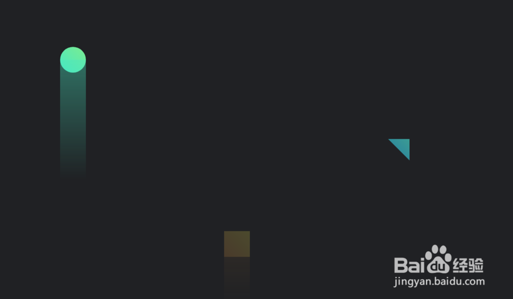
6、查看效果。